Original article (in Croatian) was published on 12/7/2024; Author: Anja Vladisavljević
The first map shows the weather forecast of Weerplaza, and the second comes from a completely different meteorological service – Weer & Radar.
While reports about the heat wave fill the media headlines, both with advice on preserving health and explanations that it is the consequence of global warming, some users of social networks are focused on denying the global problem.
They are trying to promote the thesis that there have been summer heats before, and that they are being exploited more recently in order to scare citizens and convince them that these are the consequences of climate change, which, according to them, do not actually exist.
“So how does propaganda work?
The first picture is from 2018, when everyone could still think normally, cheerfully and optimistically – how beautiful!
And the second one from 2023 is almost the same temperature, but the map is already painted blood red and scary”, this is the content of the post published on Facebook on July 10, 2024 (archived here).
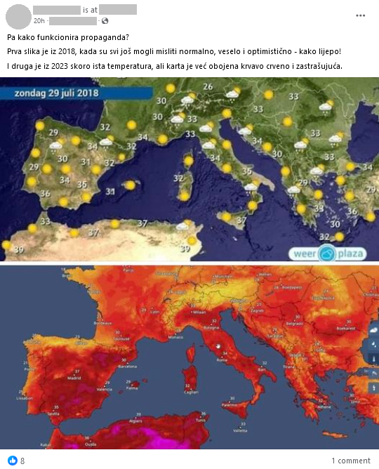
This statement is illustrated with two meteorological maps of Europe. The first map, which is dated July 29, 2018, shows a traditional weather forecast map in colors matching the landscape and topography of Europe with sun, cloud and rain weather symbols and Celsius numbers.
The second is an undated radar map (claimed in the text to be from 2023) in shades of red and orange, with European cities marked and predicted temperatures, expressed in degrees Celsius. The temperatures shown on the two maps are mostly similar, ranging from the mid-20s to the high 30s.
These contents on social networks began to spread last year, and to date, in addition to English, they have been shared in other languages: Slovenian, Turkish, Bulgarian and French. The post in the Slovenian language is particularly viral and has been shared over 10,000 times by the time this text was published.
These are different graphical representations of two meteorological websites
Social network users claim that the use of red and orange on the second map is an attempt to further dramatize the situation and that forecasters are trying to deceive viewers and make them think that temperatures have risen to alarming levels due to climate change – when in fact temperatures have remained the same.
The web portals for verifying the accuracy of claims (Reuters and USA Today) analyzed this content last year and determined it is not correct. The maps are produced by two separate Dutch meteorological websites that use different graphics.
The 2018 map shows the weather forecast from Weerplaza, a Dutch weather website. Its map remained the same later (topographic representation in colors of the landscape with weather symbols). We found similar graphics of that weather service from 2018, 2019 and 2020.
Jaco van Wezel, editor-in-chief of Infoplaza, the media outlet that runs Weerplaza, told Reuters last year that their map, unlike the comparison website, shows temperature and weather symbols without using data interpolation to create a map in other colors. “It is possible that these websites will adjust their color sets over time”, he added. According to him, it makes no sense to compare these two maps because they are two “completely different products”. He says it is nonsensical to claim that the red colors on the second map were deliberately chosen to convince people that climate change exists.
The second weather forecast map comes from Weer & Radar, the Dutch branch of the German weather web portal Wetteronline. Contrary to claims from social networks, this website did not introduce an orange-red map in 2023. It used it before, for example in 2018, 2019, 2020 and 2021.
Maps in these colors are used in this context to visualize temperature conditions. The colors range from white and gray at very low temperatures representing extreme cold, then purple, dark and light blue (freezing point at 0 degrees Celsius) to shades of green for values just above freezing.
That said, Weer & Radar didn’t exclusively display the forecast that way. For example, the current forecast can be read on several maps, and one of them is the classic one, known to everyone, with the symbols of clouds, sun, rain or snow – very similar to the one from the first picture, i.e. from the Weerplaza.
Unfounded evidence of the non-existence of global warming
Global warming, which the spreaders of the content analyzed above try to deny, is a long-term warming of the overall temperature of the planet. “Although this warming trend has been going on for a long time, its pace has increased significantly in the last hundred years due to the burning of fossil fuels. As the human population increased, so did the volume of fossil fuel burning. Fossil fuels include coal, oil and natural gas, and their combustion causes what is known as the ‘greenhouse effect’ in the Earth’s atmosphere”, explains National Geographic magazine.
A report created by the World Meteorological Organization (WMO) last year showed that records were again broken, and in some cases, they even exceeded, regarding greenhouse gas levels, surface temperatures, ocean warming and acidification, sea level rise, Antarctic ice sheet and glacier retreat. That report confirmed that 2023 was the hottest year on record, with a global average near-surface temperature of 1.45 degrees Celsius above pre-industrial levels. The data also show that the 10 warmest years since measurements began in 1850 have been recorded in the last decade.
Europe experienced its second hottest year on record last year, affecting citizens with an increase in extreme heat stress days and heat waves. These increased temperatures also enhanced the occurrence and severity of extreme weather events.
As we wrote earlier, climate sceptics are becoming more and more creative when trying to deny the scientifically proven fact that climate change exists. Last month, photos spread on social networks trying to “prove” that sea level rise – which is one of the main consequences of climate change, i.e. global temperature increase – is not actually happening. Three photos of the Brazilian rock Pão de Açúcar were taken in different periods, which supposedly show that the sea level around the rock remained the same. This is neither true nor can it be proven that way.
Also last month, theories spread that high temperatures were recorded decades earlier. As an example, an old newspaper article was taken, which was claimed to have been published in the 1960s. The article claims that on one July day in Zagreb, a temperature of 38 degrees Celsius was recorded. However, the maximum measured temperatures at a specific location are not representative data for explaining, or denying, climate change.
In addition, two years ago, also in the summer, we dealt with very similar posts like the one mentioned at the beginning of the text. Photos of two television weather forecasts for Germany circulated on social networks. As in the above case, one was in warmer, “alarming” tones, and the other was topographical.
In this way, they wanted to show that the media and scientists are manipulating and spreading hysteria about the climate crisis. In both cases, it is pure manipulation. The maps, which are expressed in a special spectrum of colors, are not designed to raise people’s awareness – or “spread propaganda” – about climate change. In addition to the increasingly measurable and tangible consequences of global warming, special weather forecast maps are not even necessary. This is why we rate the post as lacking context.
